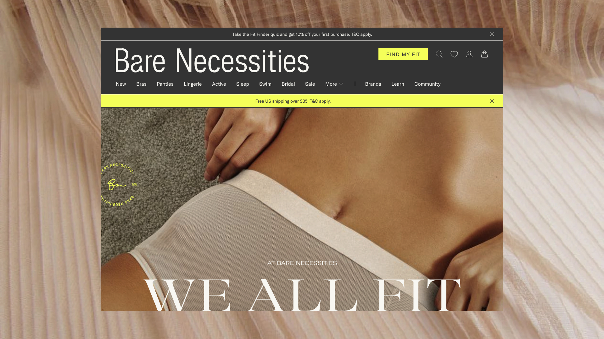


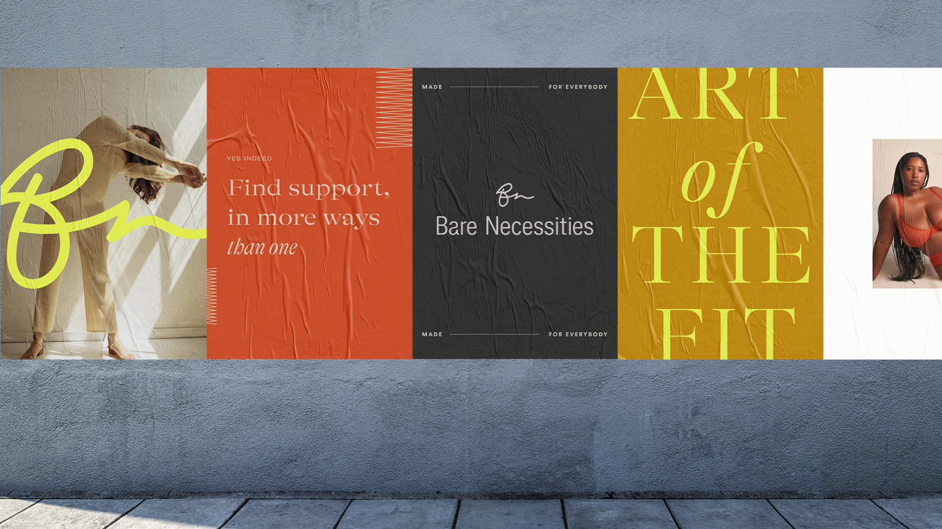
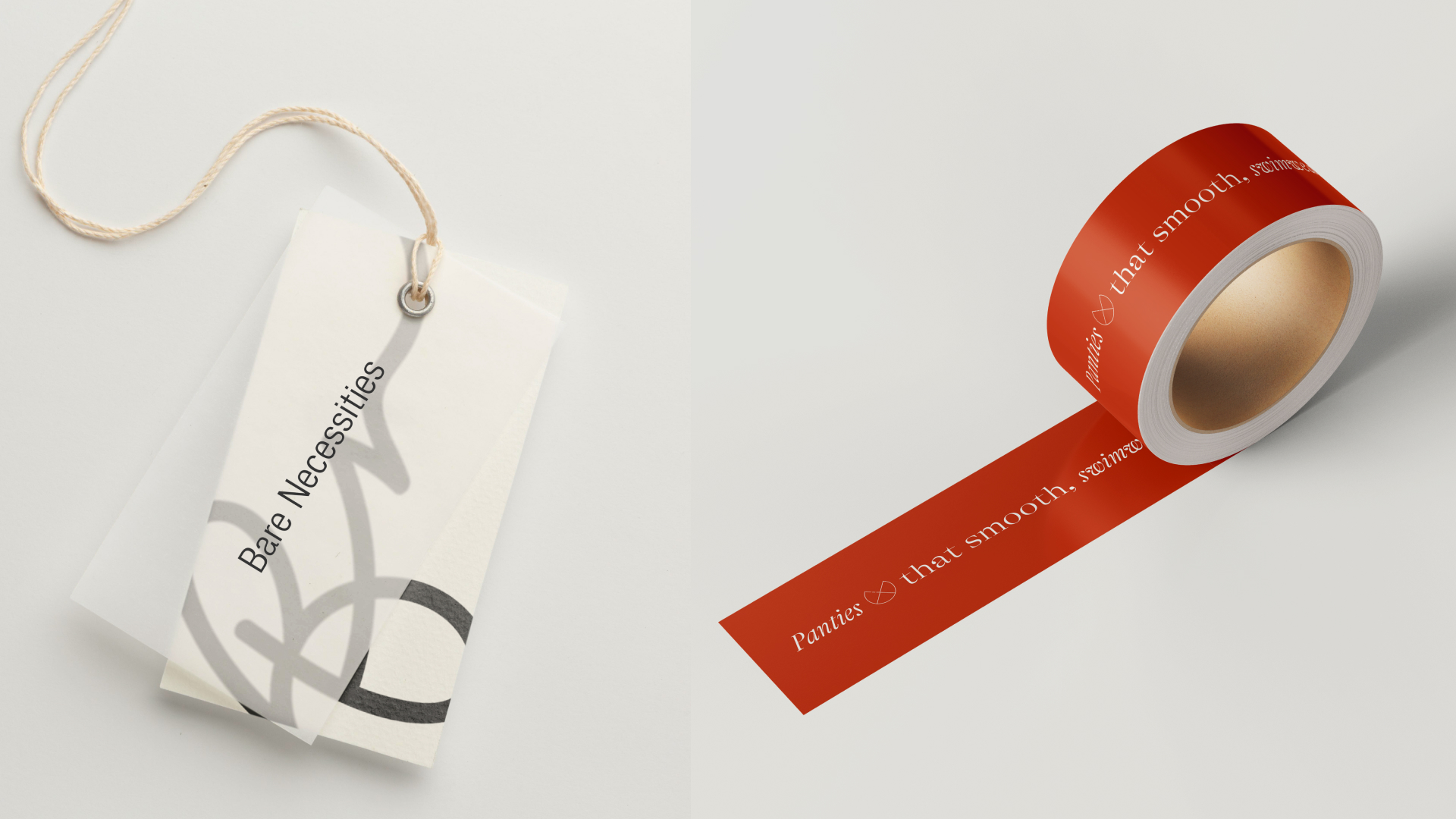

Bare Necessities
Web Design, Design System,
Brand Identity, Brand Guideline, E-Commerce
The rebrand of Bare Necessities, one of the largest online intimates retailers with an established history of inclusivity, is a visual representation of the name itself, and the contemporary, luxurious look welcomes younger audiences while maintaining loyal customers. From the refreshed identity to the website experience, the customers will feel that true beauty lies in confidence and comfort, empowering customers to feel their best in lingerie that complements all ages, sizes, and preferences.


SPORT BEACH
App Design, Web Design, Design System, Wireframe, User Experience, Prototype
SPORT BEACH is Stagwell’s Cannes Lions premiere events, where sports, business, and culture assemble on the southern beaches of France.
The challenge was to design a more engaging and visually elevated site and app to showcase information on the four-day event and furnish a smooth registration process. While maintaining the sports spirit with Rigid Square font and graphic lines, the site and app demonstrate unique layouts for each event phase, allowing users to easily browse event schedules and rosters. The new product conscientiously delegates space to promote the event and future partners. The app provides differentiated experiences from the site, which delivers an organized and personalized schedule while catering to the specified recommendations.
*As of June 2024, there have been 1000+ app downloads, and 35% more people attended 2024’s SPORT BEACH YoY.
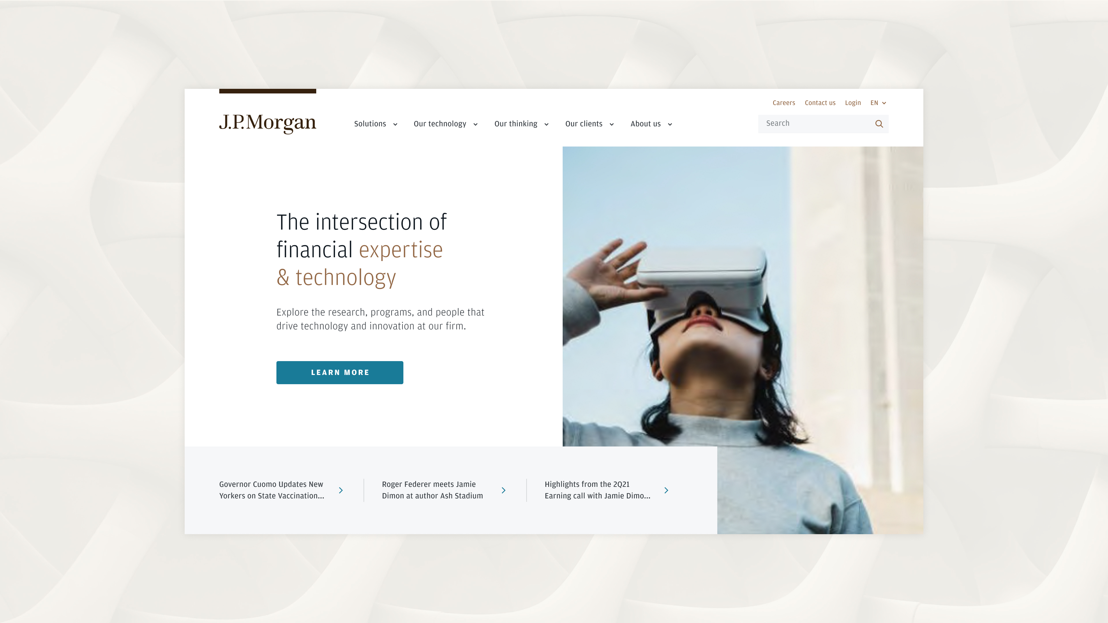


Web Design, Design System
J.P.Morgan is a global financial institution that holds a key role in leading to shape financial landscape. Its new branding needed a conversion to a digital site. The brand now has a refreshed modern, trustworthy, timeliess look that elevates their content and showcases their deep expertise.
Official site︎︎︎
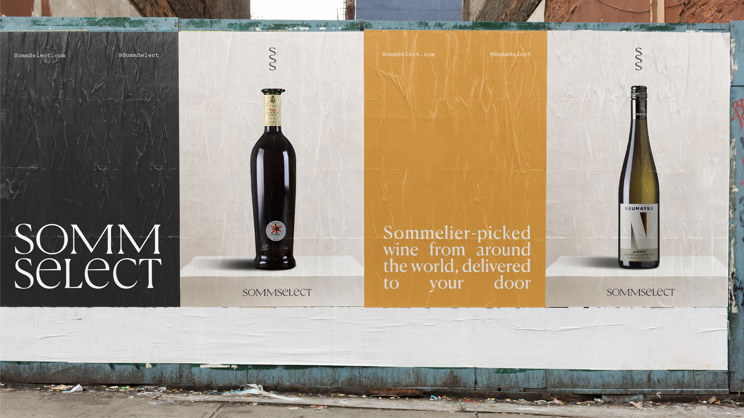
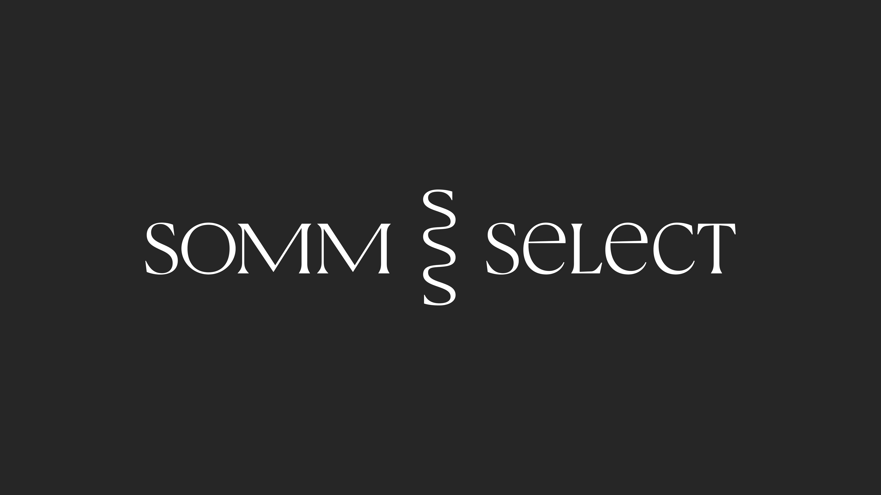
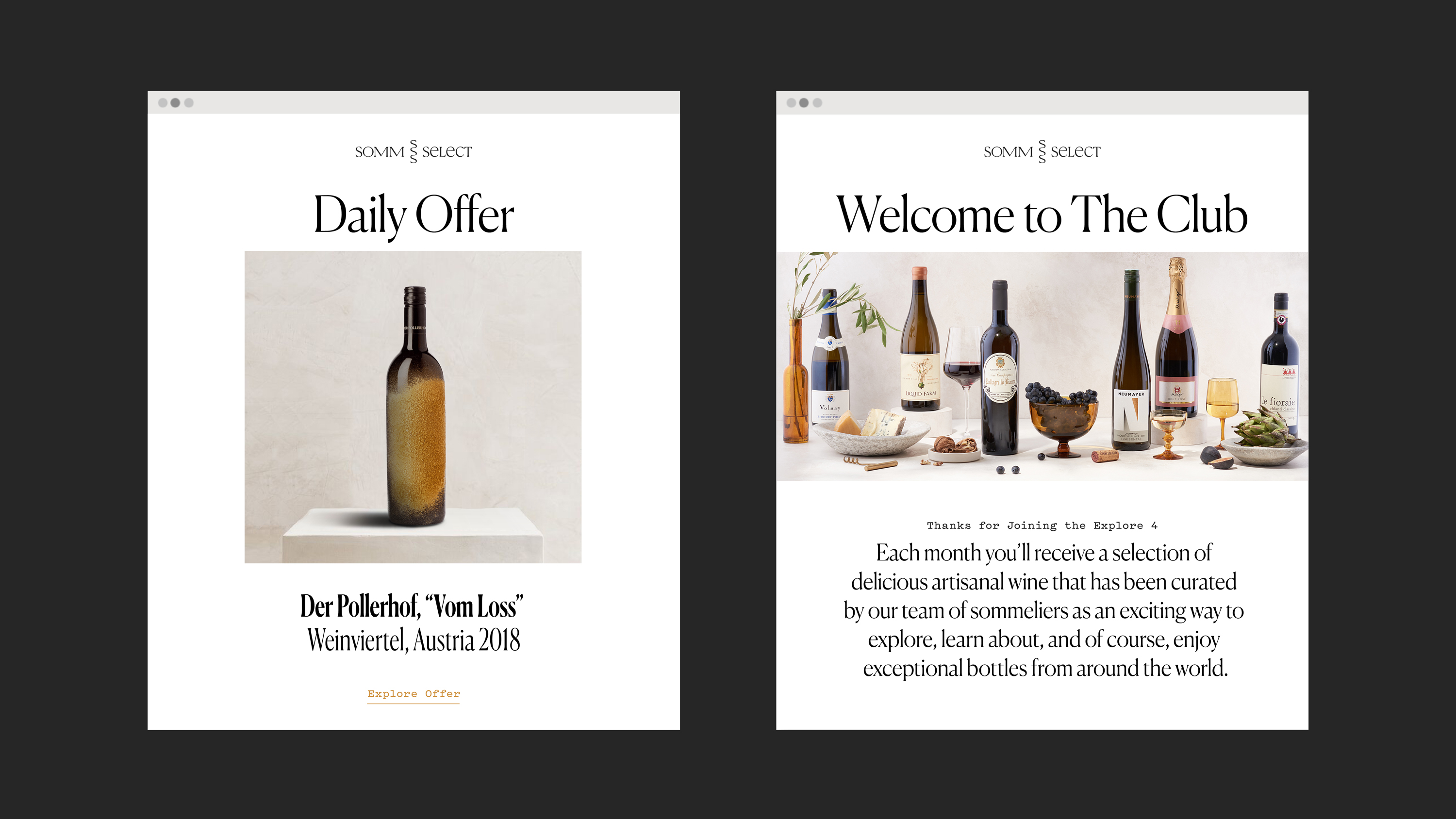


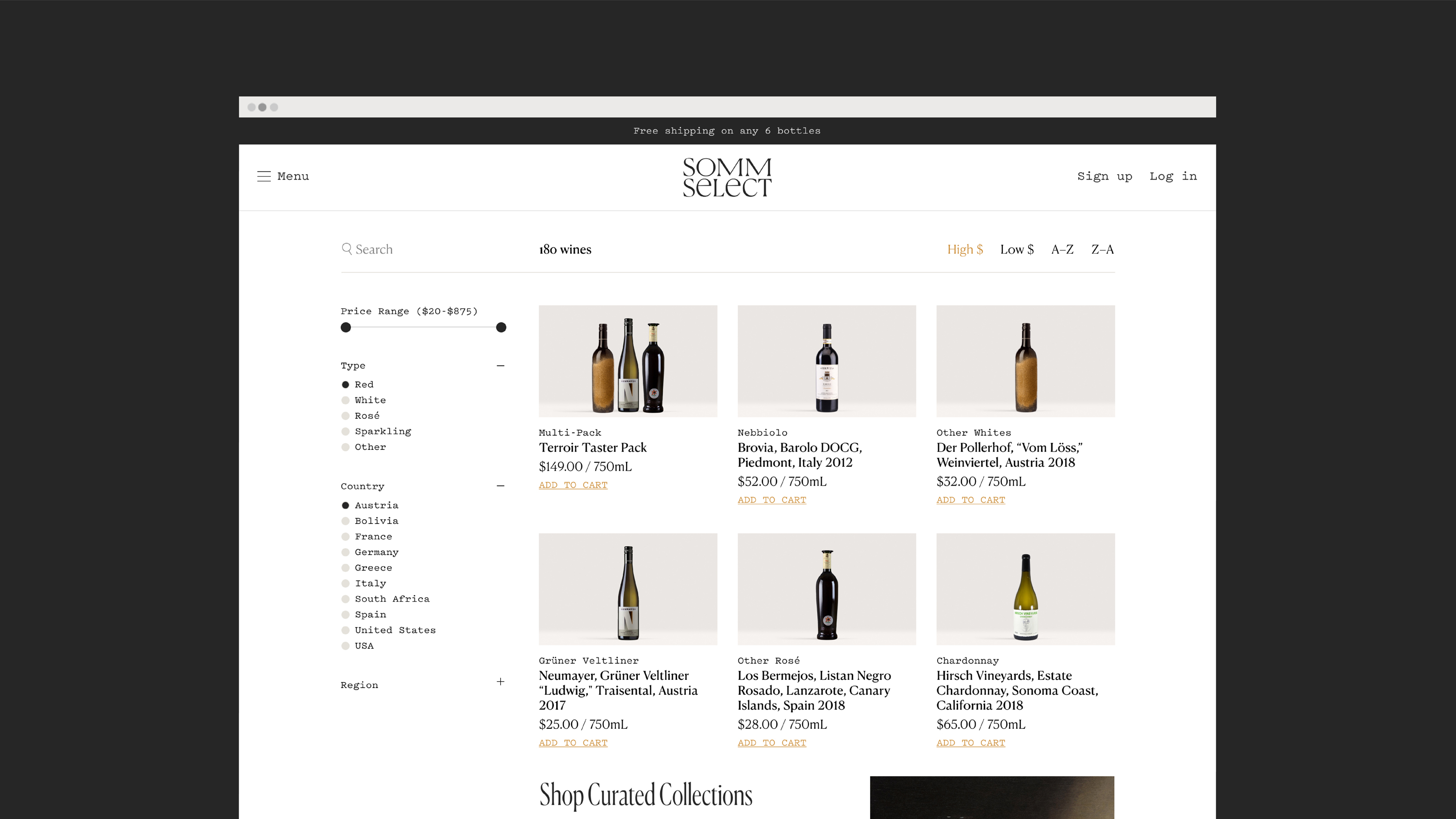
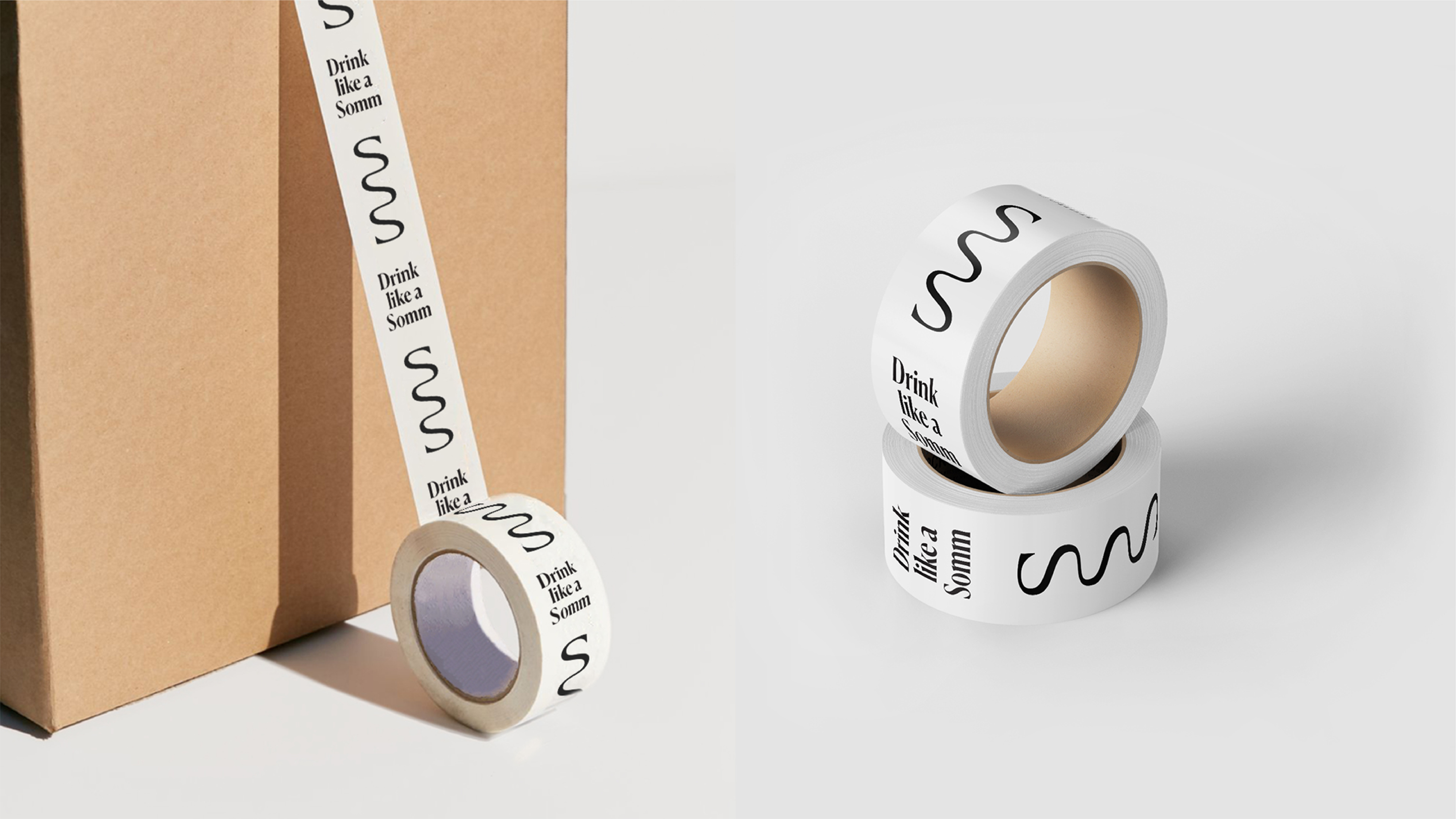
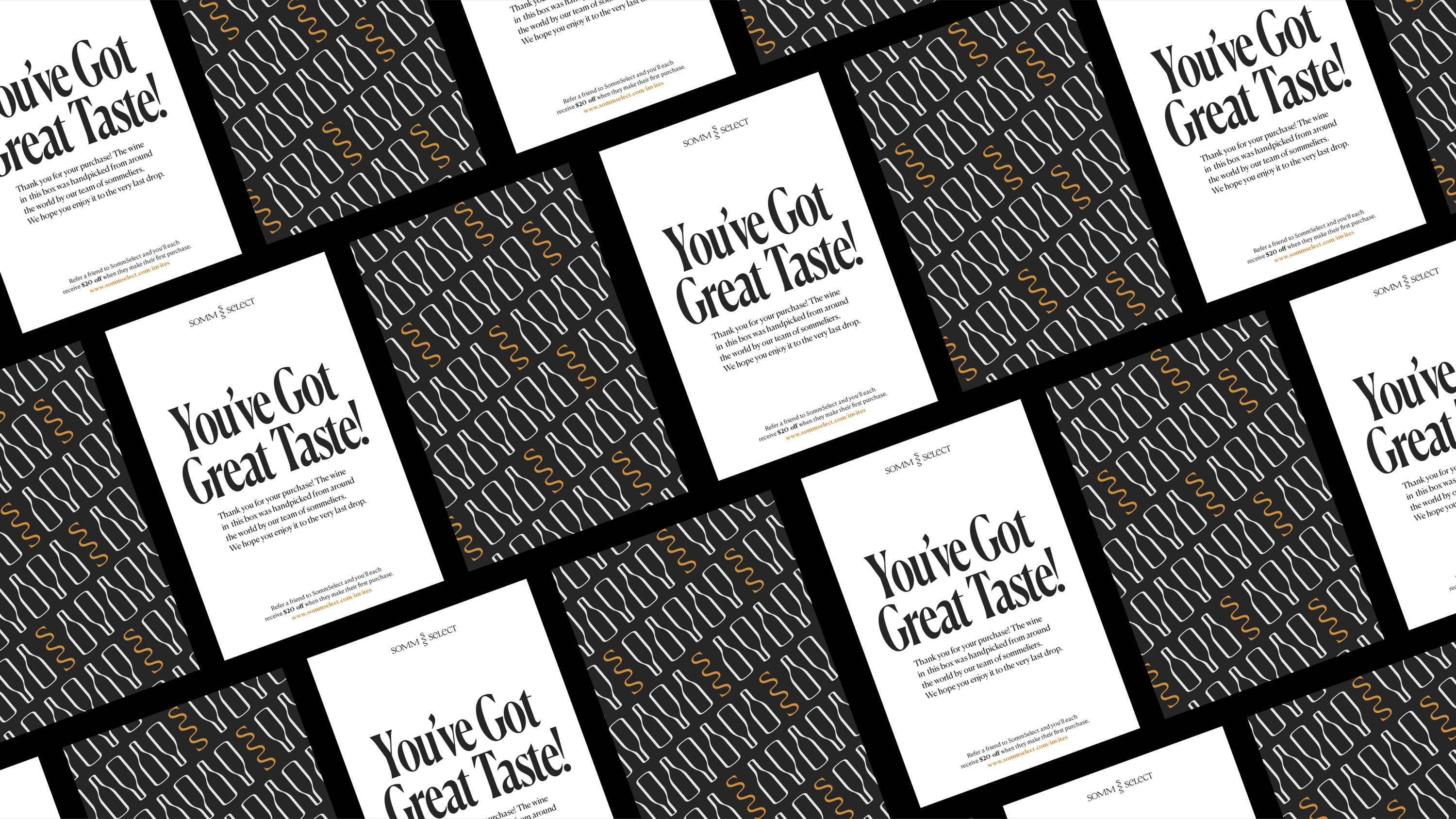

SommSelect
Brand Identity, Print Collateral, Brand Guideline